CareConnect
.
Project Overview
CareConnect is a conceptual mobile application designed to simplify the process of booking medical appointments and managing healthcare services. The app enables users to find nearby doctors, schedule appointments, access digital prescriptions, and stay informed about their healthcare journey through a clean and intuitive interface. Traditional healthcare experiences often involve long waiting times, limited appointment visibility, and fragmented communication between patients and healthcare providers. This project reimagines that experience with seamless appointment scheduling, real-time availability, appointment reminders, and easy access to essential medical information in one place.
My Role
UX Research
UX Design
UI Design
Wireframing
Design System
Testing
Tools
Figma
FigJam
Notion
ChatGPT
Notion
Magnific
Problem Statements
Booking a doctor's appointment is often a frustrating, fragmented experience — patients are forced to call hospitals, sit on hold, or dig through outdated websites just to find basic information like a doctor's specialty, availability, or patient ratings. There's no single, trustworthy place to compare healthcare providers and manage appointments from start to finish. This leads to wasted time, missed appointments, and low confidence in the provider chosen.
Problem Solution
CareConnect gives patients a simple, centralized app to discover nearby hospitals and doctors, evaluate them through transparent ratings and experience data, and manage their entire appointment lifecycle — from booking to rebooking — in one seamless flow.
Final UI


Design Process
Discover → Define → Ideate → Design → Test → Refine → Final UI
01.
Discover Phase
What I Used for CareConnect
Competitive Analysis
I analyzed existing healthcare and appointment-booking experiences to understand how competitors approach:
Doctor discovery
Search & filtering
Doctor profiles
Availability
Appointment booking
Trust signals
Location-based discovery
This helped me identify common interaction patterns, areas of friction, and opportunities that informed the direction of CareConnect.
Note: As this was a self-initiated conceptual project, primary qualitative and quantitative research was outside the available scope.
Typical UX Discovery
Qualitative Research
Quantitative Research
Competitive Analysis
02.
Define Phase
Research Synthesis
After reviewing existing healthcare and appointment-booking experiences, I looked for recurring patterns across how patients discover doctors, evaluate providers, and book appointments.
A few themes consistently stood out:
Information is often fragmented
Finding the right doctor can involve too much searching
Availability is an important part of the decision
Booking should feel like a continuation of discovery
User Persona
Research-informed proto-persona
Since CareConnect is a self-initiated conceptual project, I did not have access to real users or primary interview data. Instead of presenting assumptions as real research findings, I created a research-informed proto-persona based on the patterns identified during competitive analysis. It means taking your unproven guesses and tying them directly to existing data so they do not drift into pure fantasy.
I used AI as a supporting tool to help identify and organize common behaviors, frustrations, motivations, and expectations that a patient may have when searching for and booking a doctor. I then refined these assumptions around the specific problems identified during the research synthesis.
The persona is therefore not a representation of a real user, but a working model used to keep the design focused on a realistic patient scenario and guide decisions throughout the project.
Core User
A patient looking for a suitable doctor and wanting to make a confident booking decision without spending unnecessary time searching across different sources.
Key characteristics
Wants to find relevant doctors quickly
Compares providers before making a decision
Cares about availability, reviews, and relevant doctor information
Prefers a straightforward booking process
Can feel uncertain when important information is missing or difficult to compare
User Needs
Find relevant doctors easily
Compare before making a decision
Understand who they are booking with
Know when they can actually get an appointment
Book without unnecessary friction
03.
Ideate Phase
User Flow
The flow starts from two entry points — users can either search or browse specialties from the Home screen, or explore hospitals visually through the map on the Explore tab.
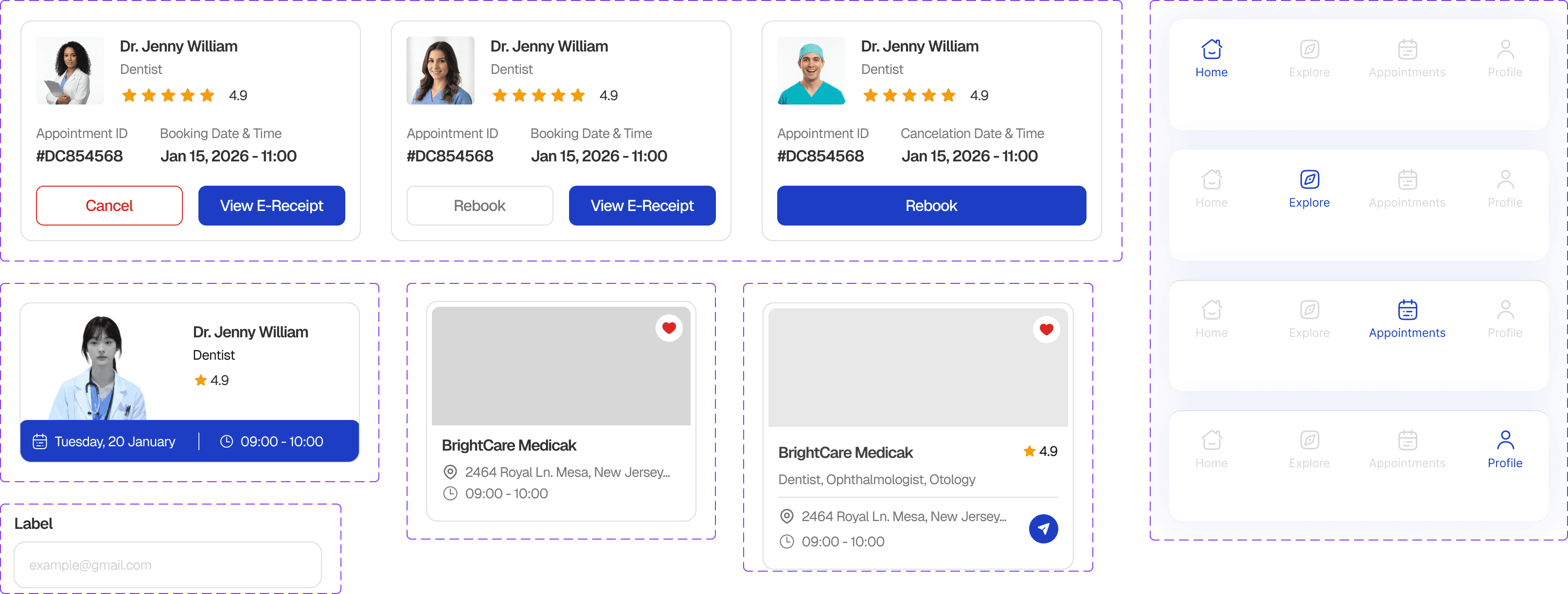
From there, users move to Doctor Details to check a specific doctor's profile, experience, and ratings before booking. Once booked, the appointment moves into the Appointments tab, where it's tracked across Upcoming, Completed, and Cancelled states — each with relevant actions like cancelling, rebooking, or viewing an e-receipt.
Both paths lead to Hospital Details, where users can view hospital info, ratings, and the list of doctors.

04.
Design Phase
I started the design process with quick, low-fidelity sketches using pen and paper.
I iterated quickly, kept what worked, removed what didn't, and gradually refined the experience before moving into mid-fidelity and high-fidelity UI.
Mid-fidelity


Design System
Icons

Components
Colors

Typography

What I Learned
Working on CareConnect taught me to design beyond the happy path. Appointment apps aren't just about the moment someone books — they need to handle what comes after, like cancellations, rescheduling, or reviewing a doctor. Building out the Upcoming/Completed/Cancelled states pushed me to think about how the same information needs different actions depending on its status.
I also learned how important trust signals are in a flow like this. I initially focused on making the UI clean, but realized users need to feel confident about a doctor before booking, which is why ratings, experience, and patient count needed to show up early on the cards, not buried deeper in the flow. It also made me aware of gaps I still need to close — like the actual booking flow and onboarding — as I keep iterating on this case study.